Heatmap Reports

(![]() NEW) Heatmap reports display data as an overlay on the facility floor plan, showing occupancy across the facility. Similar to other reporting tools, the heatmap is designed to be customized. Occupancy across the facility can be displayed for any date and time range and the heatmap tiles can be manipulated to see information more clearly.
NEW) Heatmap reports display data as an overlay on the facility floor plan, showing occupancy across the facility. Similar to other reporting tools, the heatmap is designed to be customized. Occupancy across the facility can be displayed for any date and time range and the heatmap tiles can be manipulated to see information more clearly.
Select Report > Heatmap from the menu.
The heatmap report loads with automatically selected parameters. Customize the report by altering the following:
- Date Range: Enter a custom date range, select / deselect days of the week, and then click Update.
- Hours: Use the slider to select a particular time of day within a 24 hour period.
- Display: Select Occupancy, Active Percentage, or Energy Usage.
- Tile Size: Select Small, Medium, or Large.
- Tile Type: Select Color or Size.
- Color: If Color is selected as the Tile Type, use the slider to compresses the color scale, which increases the contrast of the heatmap.
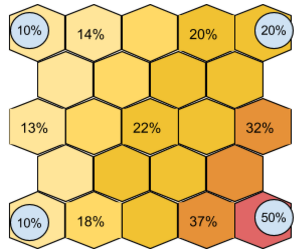
The heatmap is a visual representation of data across a space. The space is divided into hexagonal tiles whose values are not linked to a specific fixture, but instead are the result of a calculation of the values of nearby fixtures, adjusted by distance.
The value for a given tile is most heavily influenced by fixtures near the tile’s center, while less influenced by fixtures farther away. The number shown when hovering over a tile is the calculated value at the tile’s center.
The following image shows how closer lights have more influence:
Note: Using smaller tiles produces a heatmap with finer detail, not increased accuracy.
The summary data shown in the top right corner represents the average value of all lights in the facility over the selected time range. It is not spatial in nature like the heat map visualization.
- Set the date range for an extended time period to understand average occupancy over the selected time. This is useful for understanding typical occupancy for a certain shift, certain weekday, or even a season.
- Use the heatmap to look at occupancy for a particular day or hour. Drag the Hours slider to see occupancy throughout the hours of the day for a 24 hour period.
- Running an occupancy heatmap report over time lets you see how employees or customers travel throughout the facility. You may be able to identify poor traffic patterns allowing you to improve productivity. You can also use the heatmap to layout your warehouse or production lines more effectively to reduce pick times or bottlenecks.
- Occupancy heatmap reports allow you to analyze the usage of space and see areas that are under-utilized.
- Use occupancy heatmaps for security information by identifying unwanted activity such as employees traveling in restricted areas or activity outside operating hours.
- The color slider is most useful when values aren't well distributed, for example a heatmap showing occupancy on the weekend might have all low values. In these cases, drag the color slider in from the edges to increase the contrast.
-
LightRules reports have unique URLs that let you bookmark and share customized reports links. Copy and paste the URL to share with coworkers, or bookmark the link using your browser's guidelines.
- Use medium or large tiles for best performance (larger tiles reduce load time).
- Selecting Size as the Tile Type is useful for persons with color sensitivity.
-
Use the Color control to 1) view a histogram distribution of the occupancy percentage and 2) enhance the visualization to highlight desired parameters.
To enable energy cost reporting, an Administrator first needs to enter a flat rate energy cost. See the Reporting Metrics section in Reports Overview for more information.